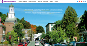
If you’re a regular reader of this blog, then you’ve undoubtedly noticed two things: first, we’ve been quiet for a while; and second, things look a little different around here. Actually, a lot different. Rest assured, you’re not imagining things.
You also may have noticed that this is the second time in a year we’ve made a major update. (Here’s how the original website looked, and here was what it looked like in mid 2014).
A lot of planning and strategy went into these changes, and we wanted to take this opportunity to explain both.
Step 1: Some Technical Housekeeping
The old website had served us faithfully for over 5 years. Unfortunately, 5 years is about 3.5 times longer than infinity in Internet time. To use a bit of software engineering slang, the site was suffering from bit-rot. The Internet had moved along, and the site hadn’t stayed current with the technology, and this was causing some problems.
HTML is the base language used for writing web pages. It has a complicated and interesting history, but for our purposes, the key thing to know is that HTML 4 came out in 1998/1999, and stuck. But there were lots of problems with HTML4. HTML5 solves almost all of these problems, but changing the Internet is a slow process. The first working draft for HTML5 came out in 2008, browsers started to add support for it in 2011, and it just became the official standard in October of last year.
The first change, which we made in 2014, was to rearchitect the site in HTML5.
This gave us a lot of things, and turned out to be a very important change — even critical — change. There were 3 main things it gave us:
- Multi-media support — better handling of audio and video on the web
- Mobile support / responsive design — a website that works just as well on a TV, a PC, a tablet, or a smartphone
- Semantic markup — better support for handicap accessibility and simultaneously, better support for SEO
Although all three of those points are important for us and our audience, it’s the middle one that turned out to be critical. For almost 2 years now, Google has been threatening to weight sites which support mobile differently than sites that don’t. A little over a month ago, Google finally took the big plunge, and started penalizing sites in search results if they don’t support mobile devices. That may sound a bit harsh, but now more than 1/2 the views on the Internet happen on mobile devices, and so any site that doesn’t support mobile doesn’t work for more than 1/2 the people who want to see it. Since Google is all about giving people useful results, this change makes sense.
Step 2: A Strategic Change
That first change was just a stepping stone, en route to the web site we have today. You see, over the last 18 months, not only have we been changing our website, we’ve been changing our business.
For the better part of a decade, we were a niche marketing agency, focused on the real estate market (agents, lenders, brokers, etc…) and the elder market (legal, insurance, retirement communities, etc…).
In 2014, we changed our business model — simultaneously making it broader and narrower. Now, we support all small businesses, regardless of industry (broader); and we’re completely focused on content marketing and social media (narrower).
Because of that change in focus, we needed to completely change the design and the content of the website to reflect our new reality. Because we believe in “practice what you preach”, the entirety of our own marketing efforts are now content marketing and social media promotion.
We hope you love what you see, love the direction we’re headed, and find some value in the content we provide here. We’d love to hear what you think, so please leave your comments below!
[cwrcta id=’read-blog-sub-insiders’]

